COLOUR
Colours are used in design to attract attention, group elements, indicate meaning, and enhance aesthetics. Their usage should be in proportion because if applied improperly, colour can seriously harm the form and function of a design.
Number of Colours
Use color conservatively around five colors in a design. Do not put too many colours in one design because it might caused complexity. Number of colours should be just enough to cause attraction and attention.
Use color conservatively around five colors in a design. Do not put too many colours in one design because it might caused complexity. Number of colours should be just enough to cause attraction and attention.
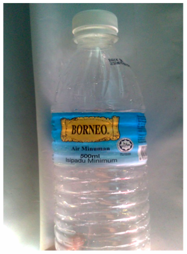
The colours on the label of the bottle are just enough to bring about attention. This picture is taken from our own source.
Color combination
Appropriate use of colour combinations to create good effect. Combinations of opposing colours in a colour wheel such as yellow and purple will create a nice contrasting effect. Moreover, the usage of adjacent colours in a colour wheel can enhance beauty and aesthetic value in a design.
Appropriate use of colour combinations to create good effect. Combinations of opposing colours in a colour wheel such as yellow and purple will create a nice contrasting effect. Moreover, the usage of adjacent colours in a colour wheel can enhance beauty and aesthetic value in a design.
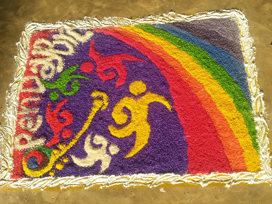
The photo of the 'Kollam' as shown above was taken during 'Kollam Competition' BRC early this year. There are the usage of the colour purple and yellow (opposing colours) & the colour red, orange and yellow which are analogous colours.
Saturation
Use saturated colors (pure hues) when attracting attention is the priority. Saturated colors are perceived as more exciting and dynamic. As saturation increases, the amount of gray decreases. Brightness is the
amount of white added to a hue. As brightness increases, the amount of white increases.
Use saturated colors (pure hues) when attracting attention is the priority. Saturated colors are perceived as more exciting and dynamic. As saturation increases, the amount of gray decreases. Brightness is the
amount of white added to a hue. As brightness increases, the amount of white increases.
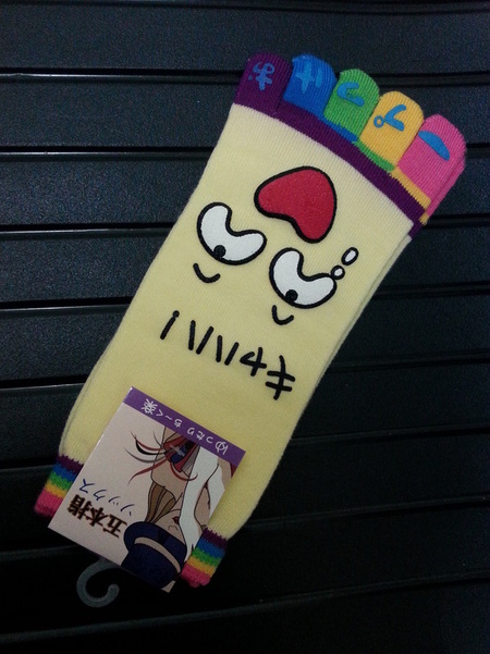
The design for the pair of socks shown above apply the usage of saturated colours. The colours are all bright colours . Socks was bought from Summer Mall.
Symbolism
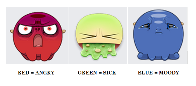
Colour in symbolism is still not universal and is highly dependent on cultures for its meanings. Taking examples of the few emoticons and moods used in Facebook, we can see some usage of colours to express a particular emotion. Generally, the colour red us always being associated with anger, colour green is related to sickness and blue is being associated with moody feels.
Example: Emoticons used in Facebook
Source: Snipped from Facebook
Explanation: The usage of these different coloured emoticons further expresses oneself in terms of their emotions and feelings. These coloured used for emoticons are quite common and easy to be understood.